Three Sleek and Modern Kitchen Designs
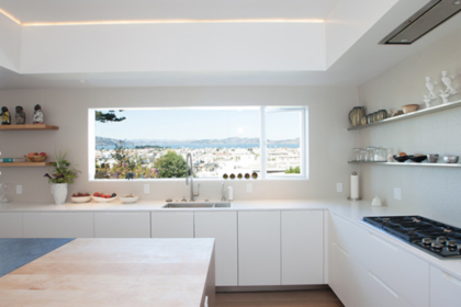
We generally have a one-track mind, with wine racks always on the mind. However, we do love to stalk the internet for amazing design inspiration, even when it doesn’t involve wine storage. This month, we check in on three incredible kitchen renovations that feature three different (but equally impressive) takes on modernity. Check them out, then image how a smart 3-bottle Vino Pins display could take them next level.
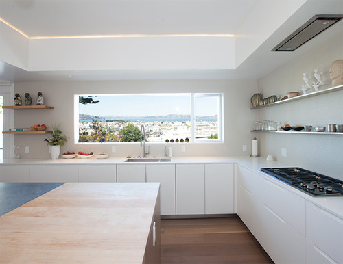 Modern Updates to an Edwardian Abode (via Design Milk)
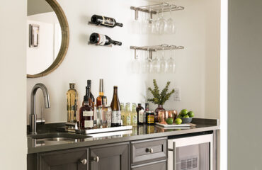
Minimalism is a fine line to walk. Too Spartan of a design can make the space seem barren, empty, uninviting and not exciting. That being said, architecture and design firm Medium Plenty knows their stuff, and they really worked their magic on this kitchen. Using a brilliant white as the primary color, the kitchen is accented by the sumptuous wood floor, adding an additional layer of depth to the space.
The island countertop and the hidden bar space are dominantly dark, creating a juxtaposition of color that pops and adds that oh-so-important variation to the space.
Row House, Remixed (via Home & Design)
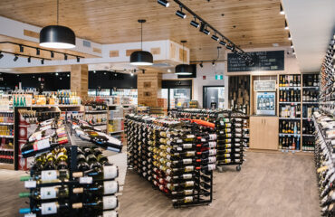
Contrasting the last entry, this Washington, DC, kitchen has much more classic, slightly rustic aesthetic, while still being delightfully modern. It uses warm, light-colored wood for its surfaces, with a darker, richer wood floor to complement it.
The space around the sink uses a cream colored tile, providing a bridge between the tan wood and the white cabinets. The designer, Jennifer Gilmer Kitchen & Bath, used the house’s curved kitchen wall as a springboard for several design-oriented accents, including curved shelving along the wall and a distinctive curved kitchen island to mimic it.
The wrought-iron accents bracing the island top contribute to the classic feel of the kitchen as a whole.
The Retro Diner Kitchen (via Country Living)
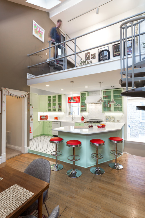
As contradictory as it may sound, your design doesn’t have to be contemporary to be modern. Case in point: This Chicago kitchen started out as a flat, drab, uninviting space that’s absolutely dreary to look at, let alone cook in. That’s where Larry Lambert of Chi Renovation and Design came into the picture.
He transformed the frumpy space into a time portal to a mid-1950s malt shop, featuring a green-dominant color scheme that skillfully employs bright red accents without looking tacky or overly Christmasy.
Octagonal white tiles on the floor and stainless steel light fixtures on the ceiling frame the kitchen with a delightful, vibrant pop, and the design even incorporates throwback-aesthetic appliances, like the fridge and the stove. You can almost hear Ritchie Valens playing in the background. Two chocolate malts, please.


